
Blog
ADA signs are designed, manufactured, and installed by sign shops all over the area. Some are done correctly. Many are not. The truth of the matter is that for signage experts, the guidelines for ADA signs are fairly straightforward. There are a few simple rules and key aspects to ADA signs that must be followed.
There are two main reasons why organizations fail to meet the guidelines. The first is simply ignoring the regulations. The second is a lack of knowledge. Both can end up costing you tens of thousands of dollars in fines. To give you an idea of what is needed to avoid these stiff penalties, Salient Sign Studio has put together a list of some common mistakes made with ADA compliant signs in Oak Park MI.
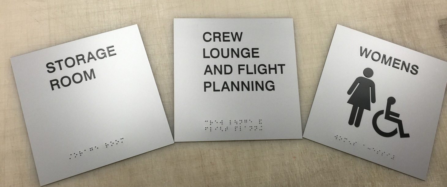
Incorrect or Missing Braille
 There are several different methods for manufacturing Braille signs and each way can produce compliant signs. According to the 2010 ADA Standards, there are specific codes addressing the cell spacing, placement, and the structure of the dot. The language is very precise, but essentially, you are required to have Grade II Braille in the Detroit metro area.
Unreadable Fonts
When it comes to design, font is often a nasty four-letter word. Many companies ignore the fact that the tactile typefaces on ADA markers must be San Serif. Helvetica is the most popular font for these purposes. If it does not go well with your branding, we suggest having the tactile characters blend in with the background and use the font you have on your other marketing materials in a contrasting color with the background for a dual message.
Mounting Signs too Low
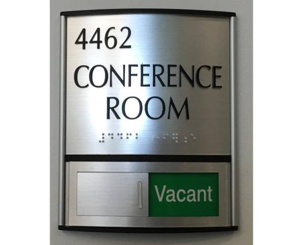
 The mounting requirements for ADA signs changed with the 2010 Standard. The height of the sign can vary from four feet to five feet above the floor. Most of the mounting details are spelled out in detail in the code. We can make certain that your markers are at the right level.
Too Big or Too Small Characters
The tactile characters have simple requirements: they must have a depth of between 5/8†and 2â€. However, this rule is commonly broken when the design does not have enough room for compliant tactile characters and Braille. If you have a dual message sign, you can get away with half-inch tactile characters.
Poor Character Spacing
 The letter spacing, or kerning, is one of the most annoying parts of the Americans with Disabilities Act. According to the most recent standards, there must be a minimum of an eighth of an inch between the two closest points of any tactile characters. Difficulties arise when certain letter pairs are naturally closer together.
Do all of these requirements have you scratching your head? No problem! Just call in the experts at Salient Sign Studio, and we will perform a site evaluation and make recommendations for what markers you need to be in compliance. We will then fabricate your signs to the ADA specifications and install them for you. For a free consultation on ADA compliant signs in Oak Park MI, contact us today!