Blog

Are you interested in learning more about designing exterior signs? It does not matter whether you run a charity, manage a service enterprise, or own a shop. There are some universal signage tips that apply to just about every situation. To help you along the path of imagining your perfect outdoor sign, the graphic artists and technicians at Salient Sign Studio have put together this exterior sign design FAQ for Birmingham MI.
Is Sign Design Really All that Important?
 You create an impression in the mind of shoppers with your organization’s name. Much of the time, this is done with the display of your logo and name. Therefore, it just makes sense for your exterior building signs to display your branding in the best way possible.
Where Should I Install My Sign?

\
The installation location of your exterior signs depends heavily upon zoning regulations. Most exterior signs are installed toward the side or top of your building or directly above your entrance. Of course, you should probably consider a pole sign if your enterprise does not get much traffic passing by its entrance but happens to be located near a highway overpass. We recommend mounting your sign higher rather than lower whenever possible.
What Is the Best Font?
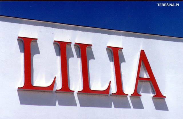
 The appropriate usage of font for your sign is determined by your business type. On the other hand, there are some typefaces that are easier for drivers traveling by your establishment to read than others. For instance, a traditional bakery might like script, but it is hard for drivers to read as they speed by. Motorists can easily read serif fonts, which are appropriate for just about any kind of enterprise. Also, the faster cars are driving by your venue, the larger your letters must be to be legible.
How Does Color Play into Sign Design?
 Color psychology has proven to be immensely useful in the creation of exterior and interior signs. Different colors send different subconscious messages to shoppers. For instance, green hints at eco-friendly products and services. Blue tends to encourage buying. Our graphic designers have a deep understanding of how colors influence emotions and attitudes.
How Much Text Should I Include?
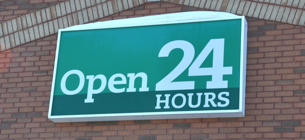
We recommend a minimal amount of wording for your signage as a general rule. Most organizations only display their name. But, if you want to display more information, a lightbox cabinet sign may be your best option. This product allows you to showcase your business’s name and logo in large, bold lettering, and in a smaller font underneath, you can feature your tagline.
Should Symbolism Be Included in My Signs?
The use of symbolism is ideal for markers. You have very little time to grab the attention of consumers, and if they are behind a wheel, you have even less. Pick a symbol that perfectly embodies what your company is about.
If you are still scratching your head about how your outdoor signs should look, let us help! Contact the friendly professionals at Salient Sign Studio today for a free consultation on exterior signs for Birmingham MI.


You must be logged in to post a comment.