


Blog
In the following, we will show you some of these “famous” signs and try to see what can we learn from other people’s mistakes.
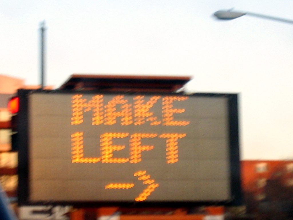
- When the Text Is Too Concise.
Nobody likes long signs and it’s advisable to have a concise message if you want to have positive results. But this sign? Well, it seems like they took the advice a little too seriously and the sign is too concise for its own good. Let’s face it! If Diesel Fried Chicken is the main specialty in this restaurant, then I will settle with just a glass of water. On a more serious note, this issue could be solved extremely simple with a delimitation between the two products, and nobody would ever have to wonder how diesel fried chicken tastes like.

- When the Sign Is Good But the Placement Is Inappropriate.
When displaying a sign, its placement is as important as the sign’s content. If you look at this picture, you will see a perfectly normal sign, which points to a baby changing area. The sign is self-explanatory and there is nothing wrong with it, aside from one little aspect. We know that you saw it, how could you not? That trashcan ruins the sign and it gives us mixed feelings when we are looking at the final “work of art.“
How to prevent a situation like that from happening? Don’t place trashcans or any kind of objects near your signs. The sign should be located on a clear area and shouldn’t interfere with other items.

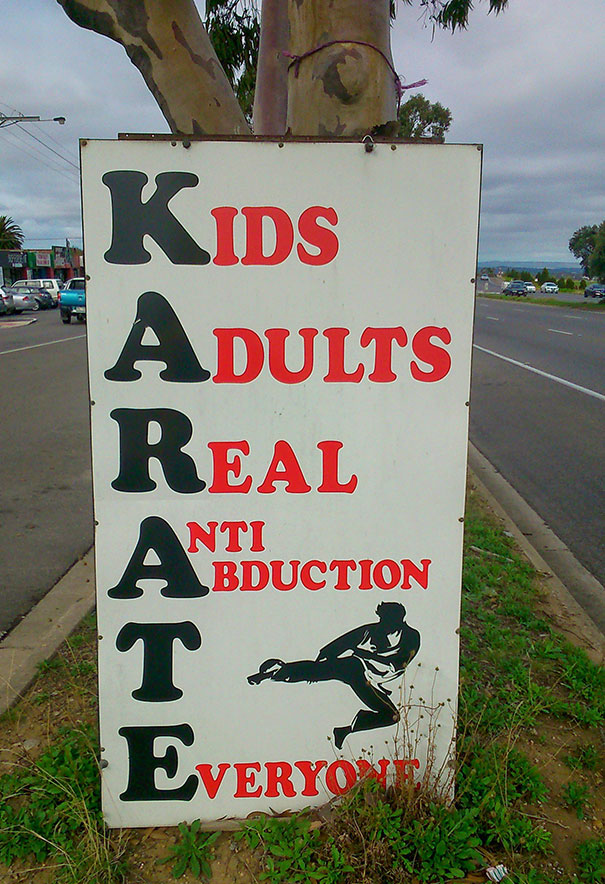
- When You Try Too Hard.
Signs with acronyms are always an engaging and accurate way of presenting your services. However, if you decide to go on that path, you will have to create a smart pun, which is both catchy and informative. Because it’s a pun, the words don’t have to be strictly related to your particular service, but you shouldn’t deviate from the topic.
It seems that the designer who made this sign also heard about this rule, but unfortunately lost his inspiration while writing the text. In order to avoid that, you should maintain a certain pattern and not write random words, just because they fit in your pun. If you cannot achieve a satisfactory result, then you should consider working with some professionals.

Simplest Way to Avoid Signage Mistakes.
Nobody wants to make mistakes, but sometimes they just happen. The best way to avoid problems like that and to benefit from accurate and engaging signage is by working with a specialized company. At Salient Sign Studio, we will design the most effective signage for your business, providing you with valuable positioning tips. Contact us today and get some professional signs.
You must be logged in to post a comment.